Personalise your Core
When you're ready to make Core your own, you can start personalising the colours on the system and add your image to the system.
To make this as easy as possible - we've created a personalise page. This page lets you preview how the system will look with the colours applied.
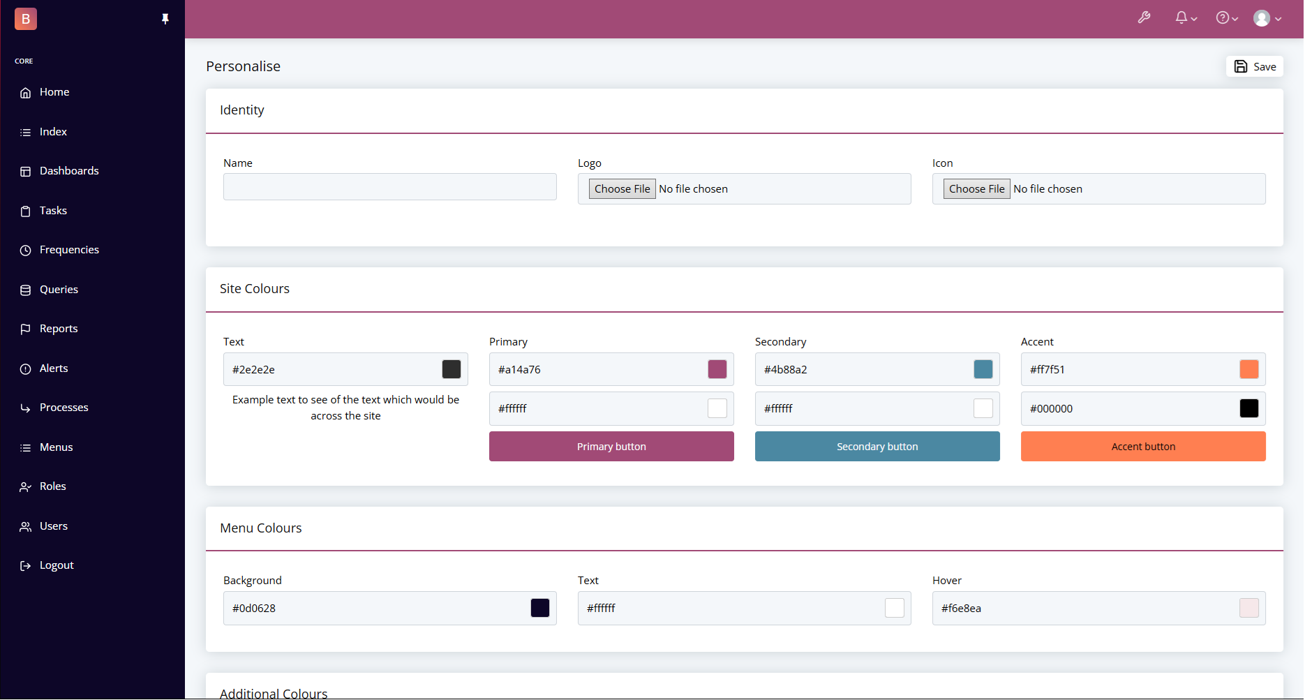
Styles on Core
Within Core there are set Colours which will be used throughout the system. Below you can see what the Colours are and some examples for where they are used.
Site Colours
| Colour | Default | Usage |
|---|---|---|
| Text | #2E2E2E | This will affect the text that isn't a part of a field. |
| Primary | #A14A76 | This covers the top bar colour, link colours, the default button colours. |
| Primary Text | #FFFFFF | The Text colour to be used on top of the Primary colour. |
| Secondary | #4B88A2 | This is only used if you choose to use the secondary colours on the buttons or column colours. |
| Secondary Text | #FFFFFF | The Text colour to be used on top of the Secondary colour. |
| Accent | #FF7F51 | This is used to accent certain aspects of the site such as the profile dropdown. This can also be selected on buttons and column colours. |
| Accent Text | #000000 | The Text colour to be used on top of the Accent colour. |
Menu Colours
| Colour | Default | Usage |
|---|---|---|
| Background | #0D0628 | Background colour of the Menu throughout the site. |
| Text | #FFFFFF | Text colour of inactive links within the menu. |
| Hover | #F6E8EA | Text colour of links while hovering and active links within the menu. |
Additional Colours
| Colour | Default | Usage |
|---|---|---|
| Success | #50D089 | Generally a green to indicate that something is 'Good' or 'Successful'. |
| Success Text | #FFFFFF | Colour of the text on top of the Success colour. |
| Info | #3EBFEA | Generally a light blue to indicate that something requires some attention. |
| Info Text | #FFFFFF | Colour of the text on top of the Info colour. |
| Warning | #FFC107 | Generally a yellow to indicate that something should be cautious. |
| Warning Text | #FFFFFF | Colour of the text on top of the Warning colour. |
| Danger | #F44236 | Generally a red to indicate that something is 'dangerous' or 'bad. |
| Danger Text | #FFFFFF | Colour of the text on top of the Danger colour. |
Alert Colours
| Colour | Default | Usage |
|---|---|---|
| Success | #D4EDDA | Generally a green colour. Used when an alert appears indicating a Success alert. |
| Success Text | #299B85 | Colour of the text for the Success alert. |
| Info | #D1ECF1 | Generally a blue colour. Used when an alert appears indicating a Info alert. |
| Info Text | #3B85A0 | Colour of the text for the Info alert. |
| Warning | #FFF3CD | Generally a yellow colour. Used when an alert appears indicating a Warning alert. |
| Warning Text | #99873C | Colour of the text for the Warning alert. |
| Danger | #F8D7DA | Generally a red colour. Used when an alert appears indicating a Danger alert. |
| Danger Text | #994442 | Colour of the text for the Danger alert. |