Form Layout
The form layout is the layout that you see when you open an edit or view page. This view gives you the option to request the most relevant information related to the content type you have created.
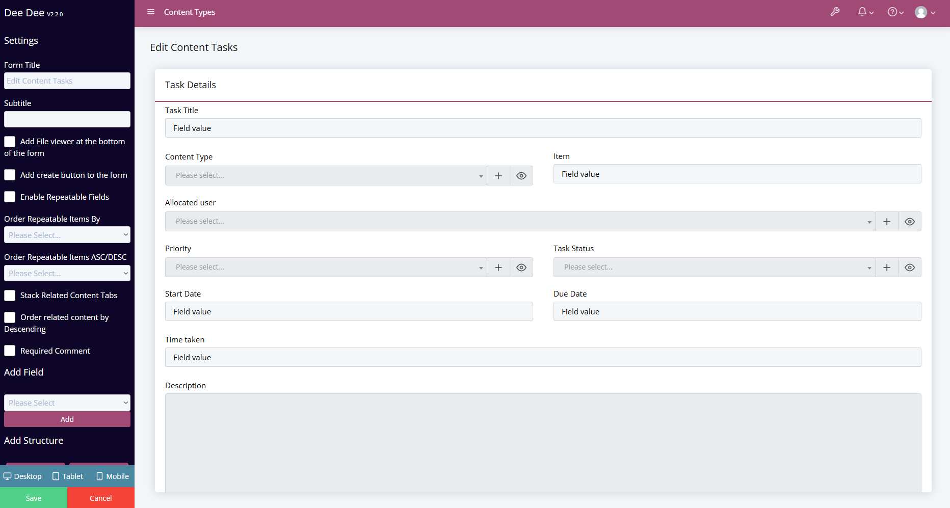
Below is an description of what each setting is used for:
Form Settings
| Setting | Definition |
|---|---|
| Form Title | This field is where you can specify the title of your form. This will be displayed right at the top of your form. |
| Subtitle | This field is where you can specify a subheading for your form. This will be displayed right under your form title. |
| Add File viewer at the bottom of the form | This enables a new section at the bottom of the form to show all the files on the bottom of the form added through Content Files. |
| Add Create Button to Form | Selecting this field will add a create button onto your form. |
| Enable Repeatable Fields | Selecting this field will turn on the option to add repeatable fields to your form. |
| Order Repeatable Items By | Choose a field from the repeatable content type to sort the items by that field. |
| Order Repeatable Items ASC/DESC | Choose whether the repeatable fields will be ordered ascending or descending. |
| Stack Related Content Tabs | When related content is enabled, the tabs controls for the related content will remove the scroll bar. |
| Order Related Content By Descending | By default, related content is order by the ascending. This option will change this to order the related content by Descending. |
| Required Comment | This will make it so when you save the item, it will pop up that will let you leave a comment before you can fully save the item. |
| Add field | This drop down box allows you to select and add your content fields onto your form. |
Structure Settings
| Setting | Definition |
|---|---|
| Add Column | Clicking this option will add a new column onto your form. This will be added underneath your existing columns. |
| Add Heading | Clicking this option will add a heading onto your form. This will also be added underneath your existing columns but you can move it to the top of your page and re-size as necessary. You can add a title to your heading by adding your header name in the text box that appears on the left when selecting the header. You can also set the size of your header bu selecting a size from the Size dropdown box that also appears on the left when selecting the header. |
| Add Description | This setting allows you to add a description to your form. |
| Add Divider | This setting allows you to add a divider anywhere within your form. You can drag it to the required area. You can also give your divider a name, a size or a style. These options appear when you have the divider selected within the layout builder, just like the header settings. |
| Add Custom | This option allows you to specify a custom layout for your form. Once you have clicked the add custom button and click into the Custom Layout field that appears at the bottom of the screen it will open up the custom layout settings on the left where you can specify the path for your custom layout. |
Column Settings
| Setting | Definition |
|---|---|
| Column Title | This option allows you to set a title for your column. The title will be displayed at the top of the column. |
| Column Colour | This option allows you to set a color for your column. The colour will be added just to your column and not the fields. |
| Add Custom CSS Classes | This field allows you to add CSS classes to your column. |
| Have the Column expand height | This setting allows you to set the column to expand if a large amount of data has been inputted. |
| Hide the Title of the Column | This setting allows you to hide the title of your column within the form. |
| Only show Column on create | This option allows you to set your column to only show when a user is creating a new item. The column will not show when editing existing items. |
| Enable expanding/collapsing | This setting allows you to specify whether you would like to be ale to expand and collapse your column. |
| Have Column Expanded by default | This setting allows you to set your column to be expanded by default. |
| Hide Column | This setting allows you to hide your column completely. |
| Config Setting Required | This setting allows you to specify the configurable settings that need to be set (Config setting name is inputted here). |
| Config Setting Value | This setting allows you to specify the config settings value for your column. Whether the setting is switched on or off (Value being either a 0 or a 1). |
| Hover Text | This setting allows you to add text that will hover above the column title when hovering over the column title. |
Field Settings
| Setting | Definition |
|---|---|
| Label Type | This setting allows you to specify the type of field. You can either set it as inline (Your field title and field will sit next to each other on the page) or standard (The field title will hover above the field). |
| Add Custom CSS | This setting allows you to add custom CSS to your field. |
| Add a helper to the field? | This setting allows you to add a helper to your field. To see information on all the helpers, see here. |
| Fuzzy Score | When the helper is set to fuzzy, this will change how closely the phrase searched is to the data in the field. |
| Calculated Default | This will use a Calculated Field to generate the data and store the result. See more about this on Calculated Fields. |
| Is the field Required? | This setting allows you to specify whether the field is required or not. Meaning the field must have data inputted in this field before you can save the form when creating a new instance. |
| Read Only? | This setting allows you to specify whether the field is a read only field. Meaning that you can't put any data within the field. |
| Turn off auto complete? | This setting allows you to turn off auto complete where necessary. |
| Only show on create? | This setting allows you to set fields to only be visible when creating. If you go back to edit this field will not be displayed. |
| Enable Character Counter | This setting is to show the max character limit when the field is in focus. Usually this only shows once you are close to reaching the character limit. |
| Format Text on View | This setting will change the field on view to not be in an input box. |
| Hover Text | This setting allows you to set add text that will hover above your field when you are hovering over the field on the form. |
| Config Setting Required | This setting allows you to specify the configurable settings that need to be set. (Config setting name is inputted here). |
| Config Setting Value | This setting allows you to specify the config settings value for your field. Whether the setting is switched on or off. (Value being either a 0 or a 1). |
| Vue Rules | This setting allows you to specify vue rules for your fields. |
Once you are happy with the layout you can click the save icon in the bottom left of the page. Now if you revisit the form view of the amended content type you should see that the fields you have just added are now showing in the view.